
Hello nerds.
There’s this cool video about a guy who visualised the entirety of Wikipedia as one big graph. I had seen a graphing project for Twitch communities a couple years back but I never thought much of it. Inspired by these two, I decided to do the same but for our very own Onrain!
Here is an interactive “map” showing almost every user on Onrain. The data will not be updated and is relevant for 13/3/2026.
https://twofivezerozero.github.io/onrain-graph/
You can zoom, click to see connections per person, and view someone’s profile by right clicking them. You can search for yourself or your friends in the top right.
Each colour tries to represent a “community” of roughly comparable groups of users. These communities are generated with an automated algorithm. Here’s my attempt at keying some of them, if you have any better labels or suggestions let me know.
I want to give a shoutout to @zegevlier for following (to my knowledge) every user on the platform, and making this possible without having to crawl the entire website. An unfortunate side effect is that @\tom had to be excluded from the graph as his existence completely messed everything up. :(
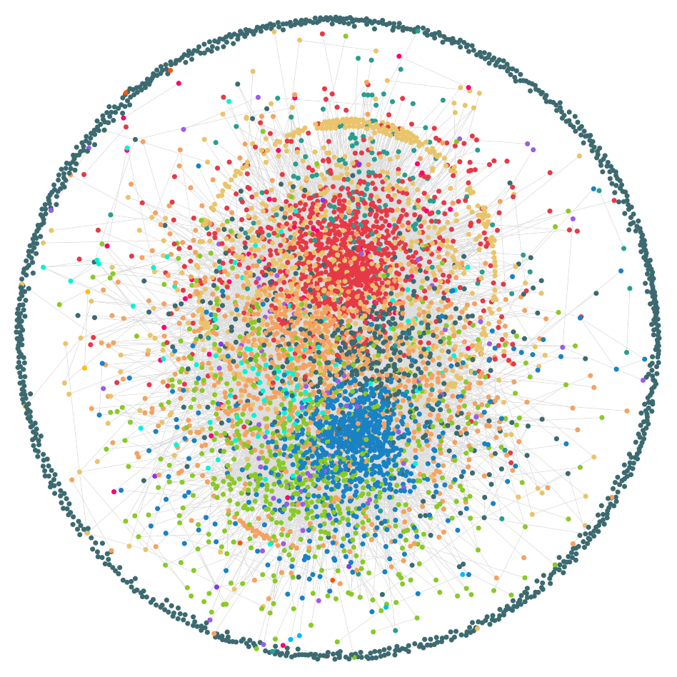
There’s this cool video about a guy who visualised the entirety of Wikipedia as one big graph. I had seen a graphing project for Twitch communities a couple years back but I never thought much of it. Inspired by these two, I decided to do the same but for our very own Onrain!
Here is an interactive “map” showing almost every user on Onrain. The data will not be updated and is relevant for 13/3/2026.
https://twofivezerozero.github.io/onrain-graph/
You can zoom, click to see connections per person, and view someone’s profile by right clicking them. You can search for yourself or your friends in the top right.
Each colour tries to represent a “community” of roughly comparable groups of users. These communities are generated with an automated algorithm. Here’s my attempt at keying some of them, if you have any better labels or suggestions let me know.
- 223 (Blue) : Recent jock profiles.
- 13 (Lime) : Recent non-jock profiles.
- 1 (Dark teal) : Old jock profiles.
- 63 (Orange) : Old non-jock profiles.
- 0 (Red) : Really early / old profiles.
- 37 (Aqua) : KPD & EMS.
- 2 (Teal) : Old troll accounts.
- 4 (Yellow) : Profiles followed by “IAmKana”
- 916 (Dark teal / outer circle) : Profiles only followed by "tom".
I want to give a shoutout to @zegevlier for following (to my knowledge) every user on the platform, and making this possible without having to crawl the entire website. An unfortunate side effect is that @\tom had to be excluded from the graph as his existence completely messed everything up. :(
Last edited:


